Grove of Trees - takes 2 and 3
Written on 2/14/2008 by Alan
I received two very useful comments about my last post. I'd first like to thank both readers for their comments. This blog is helping me learn about photography, and that's exactly what their comments are helping me with.
The first comment was that the photography lacked contrast. I played with the contrast setting and got the following result. Better?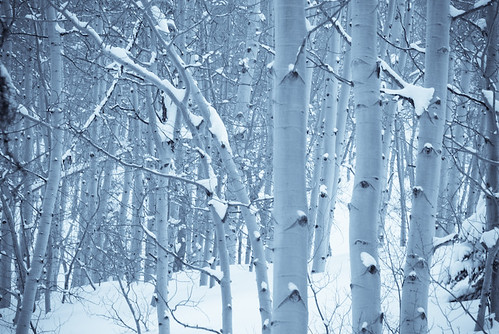
The next comment addressed my choice of creative coloring. I used the cyanotype preset in Adobe Lightroom to get the bluish tones. I removed the cyanotype and boosted the contrast for the following result.
So, what do you think?
![]()
Nicely done with the color change and contrast boost.
Good job, that was excatly what I was thinking. I would like to see a b&w version too. You should frame that one and hang it on your wall.